Beiler’s Bakery
Conceptual Brand Expansion
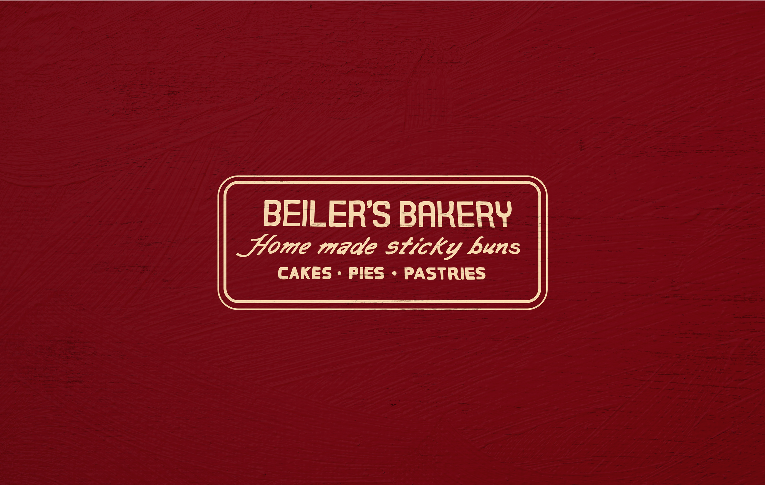
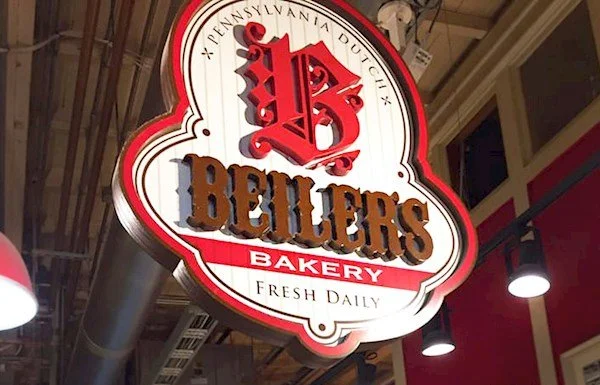
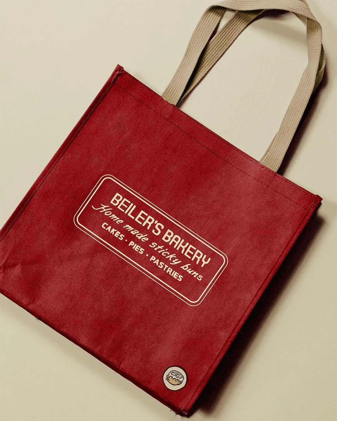
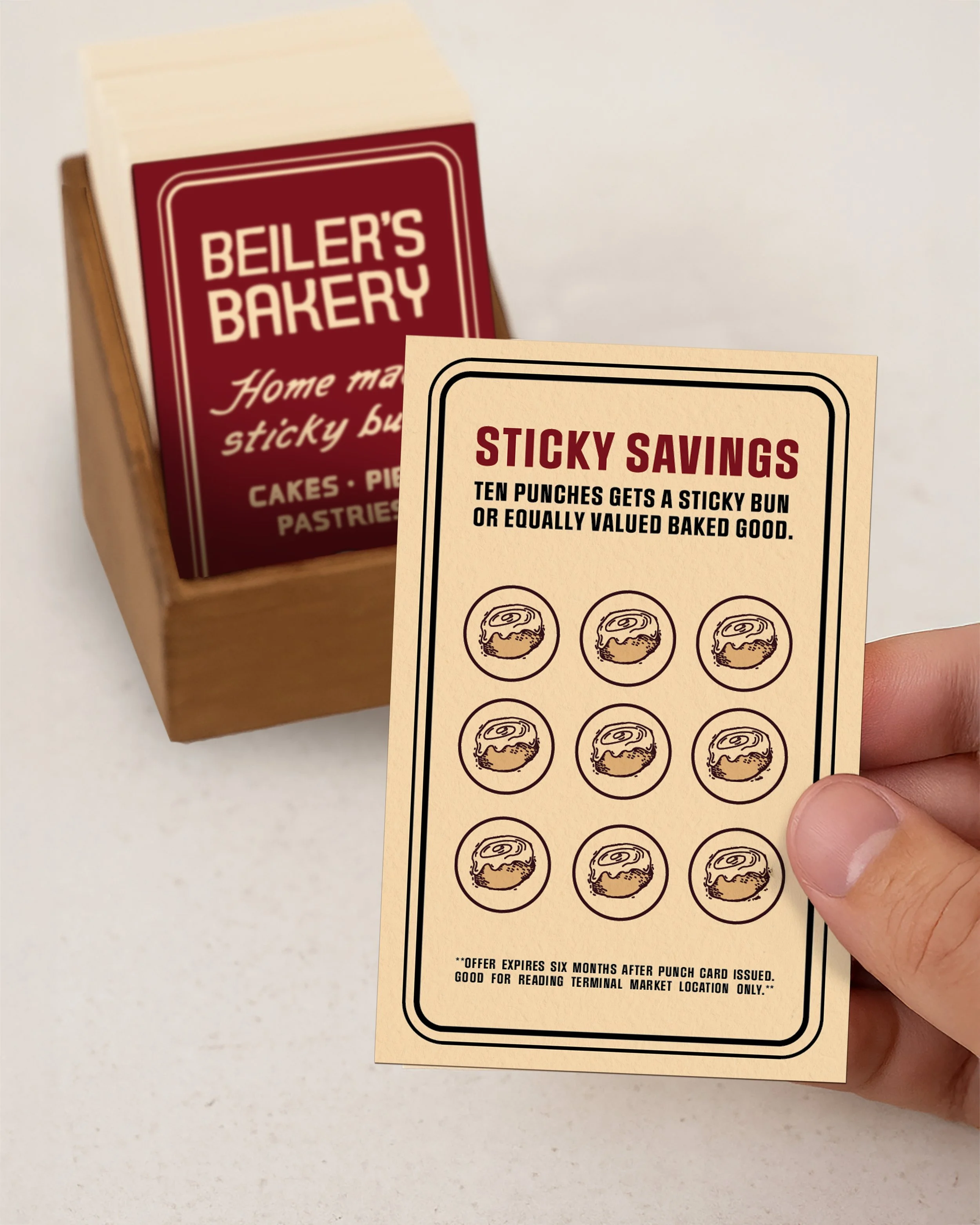
This project is a conceptual brand exploration for Beiler’s Bakery, developed as part of a design sprint focused on brand expansion. Rather than creating an entirely new identity, the goal was to build upon existing visual equity by reinterpreting Beliers’ original hand-painted signage, in Reading Terminal Market, into a cohesive brand system. The work proposes how a historic, well-loved bakery could extend its identity across packaging, signage, and merchandise while maintaining its handmade, unpretentious character.


Design Approach
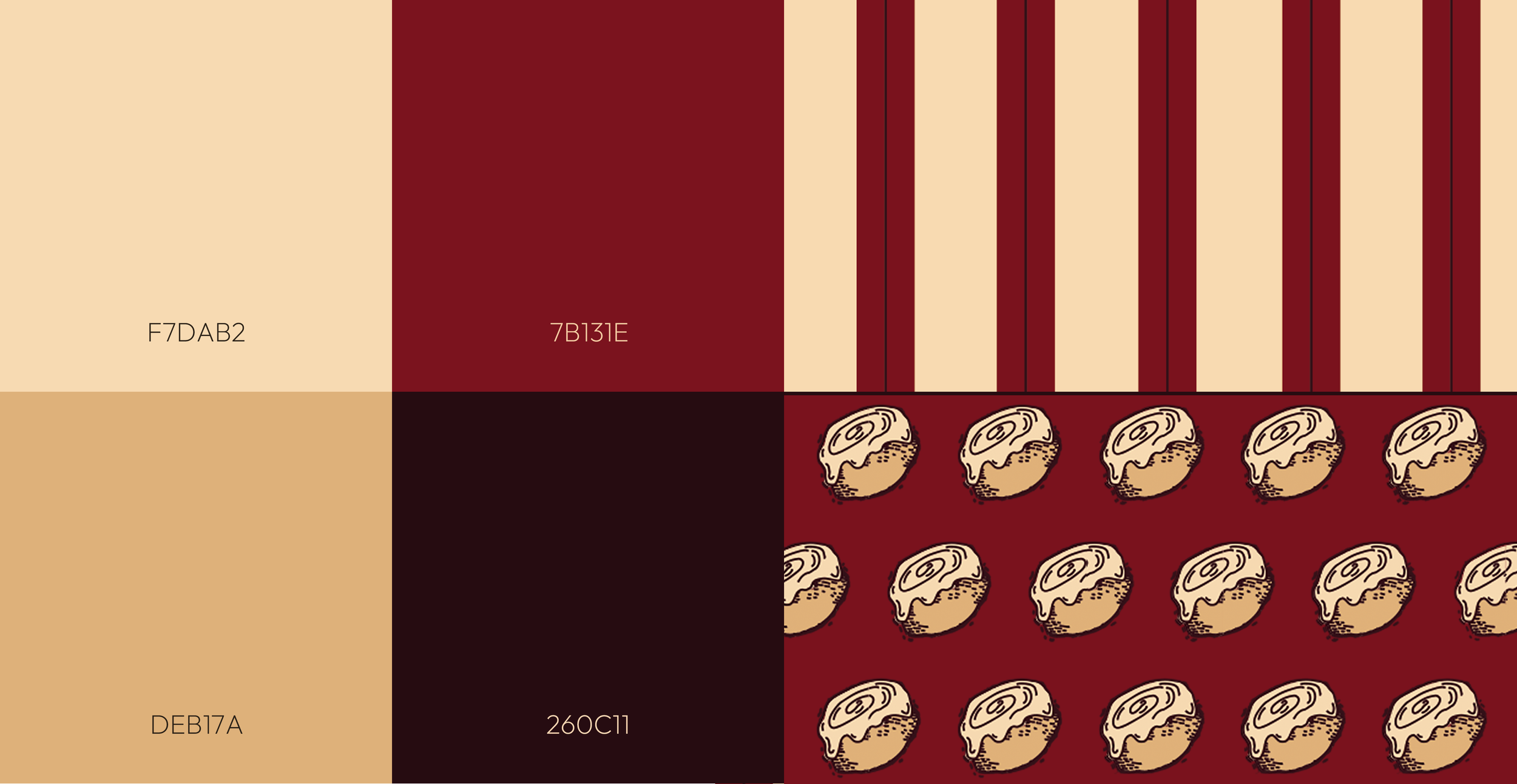
This conceptual expansion began by identifying overlooked visual equity within Beiler’s existing environment—specifically the hand-painted wall signage that communicates warmth and authenticity. Rather than replacing the brand, the project builds upon that signage, translating its letterforms, proportions, and framing devices into a cohesive identity system. A restrained palette and practical layout structures ensure the applications feel appropriate for a high-volume market setting while strengthening consistency across packaging, merchandise, and print.

Packaging & Collateral
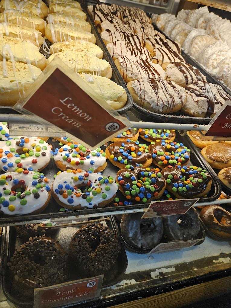
The proposed identity extends across packaging, takeaway boxes, printed ephemera, and apparel. Each application prioritizes clarity, durability, and recognizability in a high-traffic market setting, while reinforcing the bakery’s handmade roots. Elements such as loyalty cards and merchandise are designed to feel practical and familiar.


Instructor:
Jason Kernevich